Pricing pages are crucial in converting visitors/free users to paid customers. Important attributes of every pricing page:
Showcases monetization model
Easily understood
Instills trust
Assists consideration
Has clear navigation
The goal of the pricing page is to provide all the needed information to a potential customer to make a decision and then make it easy for them to take the next step.
Pricing page performance
Best-in-class in-app pricing pages with self-serve options convert ~15-20% of pricing visitors to the checkout page. Checkout pages usually convert 50% to paid customers.
Best-in-class pricing page design
After advising and seeing how 100’s SaaS pricing pages perform, here is the prototype that captures all of the best practices:
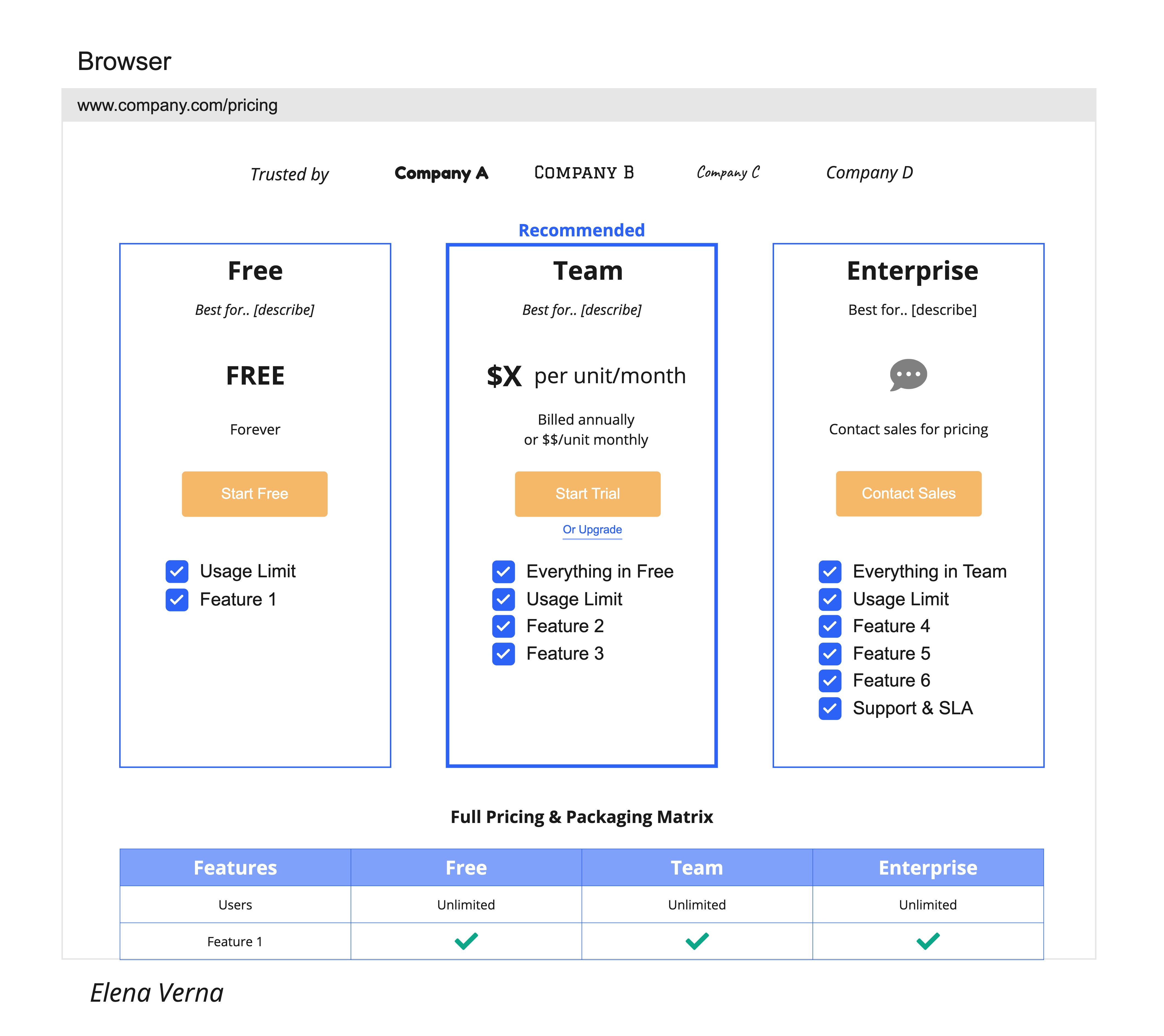
With commentary:
Always include:
Social proof of existing paid customer logos, preferably recognizable ones.
3-4 plans perform best in giving options without making it overwhelming.
The summary table showcases the main reasons for the upgrade.
Each plan has to message of whom it is best for.
Wrapped ‘Recommended’ suggestion (don’t lie with ‘most popular’).
Waterfall features with the longest list in the higher-end plan.
Clear CTA’s above the fold.
Be stingy with colors - they can be distracting.
Always use the designated color for upgrade CTA’s - preferably ‘Amazon’ gold that we’ve all been conditioned to recognize as checkout. Thanks, Amazon.
Full feature matrix peaking from above the fold.
FAQ’s at the bottom of the page.
Avoid
Treating the pricing page like it’s a home page. It’s not. It has to be optimized for function.
Designing the marketing pricing page separately from the in-app pricing page. Don’t - it only forces the user to learn two designs and reduces conversion.
Waisting coveted above-the-fold page with 'PRICING PAGE’ header. Your customer knows where they are - get straight to the point.
Distracting customers with design elements. Pricing is all about information, so the design has to be function focused and minimalistic.
Hard coding features and pricing. Make them dynamic elements that allow easy experimentation and changes!
Afterword
Don’t reinvent the pricing page design. Customers are used to a certain format, so you should use it to your advantage.
Get started with the above frame and experiment to optimize for your business and customers!
P.S. To see the best designs for the home page, use cases, profiling, and invite emails, check out this post!
Good hint at the end: People are used to a certain scheme by now. Consistency is an important usability heuristic and there is a good chance people will understand your pricing page immediately.
If you decide to evolve the scheme, do you carefully.
Really short and informative. Great article Elena! Keeping the pricing page simple and explaining to your customers exactly what they get for the price will lead to much higher conversion rate. One interesting thing I saw companies do is that they will put all features on all plans and then highlight the ones that are included, or simply make the ones that are not seem "blended" with the background. That's a really interesting visual solution for me.